Thursday, 11 October 2012

Audience Expectations - R&B Magazine

Sell lines, call outs and puffs - These are the key aspects to an RnB magazine, this is because it is one of the first things that the buyer is drawn to when sighting the magazine on a shop shelf, etc. This is particularly popular with my target audience as even the slightest bit of information surrounding famous celebrities would draw them in instantly, as my audience is aimed at the younger generation who are attracted to the latest gossip etc. For example: 'Win a FREE Chris Brown CD!' would attract the specific audience to the magazine because it is showing the readers that they can win something from purchasing this magazine. Also, Chris Brown's area within the pop industry is significantly high and is a very popular artist to the younger generation (especially teenage girls) so if they see that he is featured in the magazine then they are more likely to purchase it as he maybe a e.g. Teenage celebrity crush. This would conclude as the overall selling point.

RnB magazines usually like to use celebrities hobbies as their articles, so there could also be an attractive call-out which may read 'Rihanna's top ten must-haves' which could be presented in a bright, bold luminous colour. This would draw the reader in because they are discovering celebrities hidden secrets etc, which would persuade them to purchase the magazine at an even higher extent, particularly because Rihanna is one of the most influencial, famous pop artists of the 21st Century. This, and also that the title is presented bright etc. so it will catch the readers eyes instantly as it stands out from the background due to the wrtitng being a different colour to the box colour.

RnB magazines also tend to use specific RnB artists as their main storylines, to promote their magazine. An example of this could be from a sell line which reads ‘USHER FANS! Usher’s newsingle Boyfriend is out now!’ that would make the readers (and Usher fans especially) feel instantly involved, therefore convincing them to purchase the magazine as the topic relates to them the most and have even used their specific name  in the magazine to promote this and attract them to it as it is who they are known as.

There could also be a sell line which reads ‘Katy Perry: I have a huge crush on Will.I.Am!”. This makes the reader feel like they are getting really good/juicy gossip by placing the words ‘huge’ and ‘crush’ together, which suggests to the reader that this is a big deal and then feel like they need/want to know the full story, therefore forcing them to buy the magazine, so it is almost as if the magazine has done this on purpose.

Mast Head - The masthead of an RnB magazine has a huge impact in attracting and addressing my audience, specifically if they are presented large, in capitals or bold writing and clear for everyone to see. These are the first things that the audience sight eye-contact with and will see when purchasing or looking at the magazine as it is the largest, displayed item on the page so it will draw the reader in well. The title of the front cover should be the biggest and boldest as it stands out from all the other features. To have the title as the largest font is important as the readers need to know what the magazine is called for future reference and to make sure that they are buying the correct magazine. You could attract the audience through a title such as: ‘We love RnB’ as it means the reader can immediately understand that it is an RnB magazine and relates to all of their favourite RnB artists within this genre. This a key concept to attracting my audience as it allows them to know that this magazine holds literally all of the information which is related to their favourite music genre that they could want to fufill.

Mast Heads with the Double Page Spread - Mastheads can be used for the double page spread in an RnB magazine which would help to attract the reader as it is a pull quote and is written in direct quotations. This immediately gives the reader some information about the article before the readers actually read it themselves and tells them that it is for example: an interview. This is also useful so that the reader can sense whether the specfic article which is promoted is within their interest. By using different colours in the title it adds a big attraction for the audience and makes the page look more interesting and thought-provoked. An example of a title used for a contents page could be: ‘What’s inside...’ which is eye-catching and attracting for the audience not only because of the big writing and bright colours but also because it includes an ellipsis. This effectively makes the reader move onto the further features of the page whereas if it didn’t have it they would generally just skip the page.

Codes and Conventions - R&B Magazine

Mastheads - On R&B magazines, the mast head is usually presented towards the middle, rather than to the left, so that the artist overlaps the masthead. The masthead always stands out on R&B magazines, so that the consumers eye line should be drawn to this instantly before reading any other part of the front cover. For example: The red Q is found on all Q magazines, it always stands out from the background due to the writing being a different colour to the box colour. The masthead always has a relation for music in R&B magazines, e.g. ‘RnB' is a good example of this as it involves the word 'RnB' which is a well known genre of music and 'RnB' is also a well known genre of music internationally, and is presented Red on a White background to stand out.

Coverlines - The cover lines on an R&B magazine have some link to the featured artists of the magazine. The band or artist attracts the chosen target audience. The cover line from a 'RnB' magazine could have a reference to, for example: Rihanna, this will attract the audience as Rihanna is a huge R&B artist, so she relates to this specific genre and it's audience. It is usually presented bright and bold.

Background Image - Some R&B magazine conventions contain background images, which display a Band or an Artist who will please the target audience of the magazine. The artist in the R&B magazine etc. is the same genre of music as the magazine is, so that they contrast each other. For example: an R&B magazine which features BeyoncĂ© as a background image for an edition. Beyonce is a dominant female and attracts a huge audience, so even though she is not the feature article photograph, it will bring popularity to the magazine from audiences alike, because she is an R&B singer so she relates to the genre, and is a very famous artist.

Colour Scheme - R&B magazines are mostly aimed at both Males and Females, and is usually made clear on the front cover, so that the buyer is sure that the magazine is for him/her. The colours that they usually use are dark colours, such as: Dark Purple, Black and Dark Blue. This explains to the reader that the R&B genre of magazines are not gender-biased, as they are presented with dull colours, which in some ways would appeal to both genders as it is a mix of colours for both.

Title - The title of the magazine is usually repeated, including the date to prove that it is the latest version.

Colloqial Language - This type of language is found in most R&B magazines. This is to suit the target audience as it would usually suit a younger audience (for young adults), which an R&B magazine relates to the most.

Buzz words - These are used in R&B magazines order to attract attention, for example: "plus" and "free". These words will both influence the reader to want to buy that magazine, as there are other offers that the magazine contains, which will attract a wider audience as there is more that the reader can get out of it. This is especially popular in a R&B magazines because there is usually something extra engaging for the reader, for example: 'PLUS! Free insider on Ushers Personal life', which has used a buzz word to promote this. R&B magazines also tend to use symbols, such as: +, which would mean 'plus'. This also relates to the more colloquial language and young audiences etc., by using symbols instead of words, to say something.

Bar code, Price and Issue Date - R&B magazines are mostly expensive, so the price tends to be smaller so that it isn't the first thing the audience see as it may not impress the buyer and may put them off purchasing the magazine. However, if the magazine is cheap then the price is usually bigger and bolder in order to quickly draw in the audiences attention, which is what is sighted usually on an R&B magazine as it attracts the younger audience as they can read their, for example: Celebrity insiders at a much cheaper price, which will conclude as the overall selling point.

Tag line - R&B magazines use this to attract attention and give the magazine an edge for it's audience.

Subsidary image - These are sometimes used in R&B magazines to get you to look at the magazine, especially when well known images are used. These images may be used as a back up if some of the others do not appeal to the audience. Such as: The younger generation, who are the audience for R&B magazines, tend to be edgy about who and what is contained on the front cover for the genre as there are certain crowds, etc. that they tend to follow, so there are multiple images spread around to please all sorts of audiences.

Around five cover lines are used in R&B magazines, which also link/relate to the genre of music. There is always a main image used which is of the main band or artist, when it is a band it is usually a long shot however when it is a solo artist it is usually a mid shot, unless it is a solo artist who is looking at the camera in order to connect to the audience, using the 'direct mode of addres', however, sometimes they can also be looking away from the reader, to look innocent, etc. which can also describe their personalities, with the way in which they show their body language. This can range from being masculine and stern, to being flamboyant, which helps reflects this audience and this genre of music and the artists involved within it.

Thursday, 4 October 2012

Evaluation of Preliminary Task

To begin with our preliminary task the class and I took time to look at examples of front covers from previous copies of the 'Armthorpe Excel Magazine' picking out key media concepts that were contained on the front cover. The magazines related to the ones we are doing ourselves in the class, as it was a school magazine so we could use examples from these covers for our final peice. We found that the Excel magazines relied to much on the Mast Head and the large images in the background which stole too much attention from the cover lines etc. that are crucial to the front cover. The class decided as a whole that the magazines were fairly basic and was very minimalism, as they emphasized extreme simplication of form.

The target audience for these magazines are aimed at eleven to eighteen year olds, as they are the ages of the pupils in each year at the Armthorpe school, and are the people who will be reading these magazines as they are given to them. This explains why the magazine is very basic, as children are not interested in magazines if it contains too much information and uses many different magazine conventions, as it is not what they are used to, and will not understand what the conveyed message is and choose to simply ignore it. This can also mean that the pupils will not be interested in the images either, unless they are presented of a particular style which relates to their generation or contain images of the pupils themselves. The more informal side of this magazine would be beneficial to the children's parents, to find out about information which affect their child's everyday life around the school.

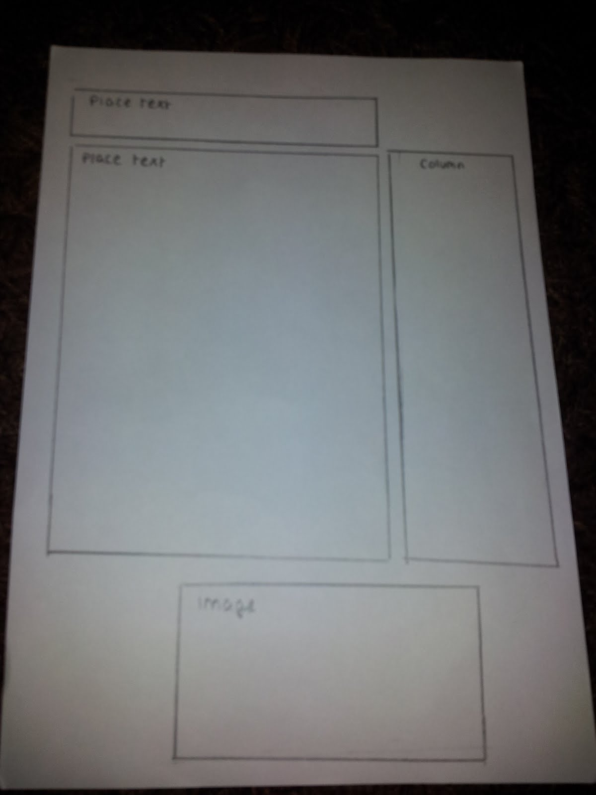
After we had finished looking at School magazines we began to plan ideas of our own. The planning process started when I drew three different front cover pages and three different contents pages. All of our ideas in the class were independent. We had to be individually minded, with the ideas being thought about to be provoking, different and effective. During this time we learnt how to draw specific key symbols towards a magazine, which help to correspond what and where something will be on the magazine, for example: A box which contains an 'X' through the middle represents the image which should be placed there. At first the desinging task proved to be difficult as we had to create these images on PhotoShop which I had never used before at the time so it was hard to focus, and because of this reason I simply chose to do a straight-forward design.

Finally, after drawing the three different front cover and contents pages we began to draw our template on the PhotoShop software. During this stage when designing the layout, none of us had taken our photographs yet, however we had to place the textual information where it was needed and then later add the images in the corresponded places. Taking the photographs was one of the most important sections of the preliminary task, as they were crucial to the main article, etc. in the magazine and it is one of the things that the reader will first draw their eyes to when the magazine is purchased. The photographs had to be taken accurately and by doing this the class followed the 'rule of thirds' process which explained all of the proffessional ways a photograph can be taken and the positioning of photographs, etc. for the magazine.

 
Completed Front Cover:


The Mast Head of the front cover is positioned towards the top left corner of the page as people begin to read from that side, with the size being not too large as it only needs to take up the top fifth of the page. I rotated the mast head slightly so that it fills the top, left hand corner of the page more efficiently and makes it more interesting for the reader. The font is large and presented as a dark colour over a light background. The font is displayed in sans serif, which reflects that the magazine is modern and not like a newspaper, to match the proffesional tone of the school's 'academy' status. This will especially engage the older pupils of the school and the parents of these pupils as the magazine is easy to read and has an informal layout.

The house styles of my completed front cover are light blue, dark blue and white. This is to coincide with the school's atmospheric tone and the uniform etc. The background image, which is presented as film strips painted in light blue and shades of white and blue bubbles is used to contrast with the house style, and also the theme of the feature article photograph which is displayed as 'movies'. The background keeps in co-ordination with the three house colours, to help contrast with the textual information so that they do not clash, to help make it visibly clear to the reader.
  
The feature article photograph is displayed as the main image of the front cover as it has it's own large advertisement. The image is large and takes up almost half of the front cover and was also placed to the right hand side of the page, which suggests a two-column house style. The photograph consists of Bethany holding up a video camera and was taken as a Medium Shot as it is from the waist up, which will entice the reader to the video camera which she holds up as it is the specific topic of the main article. If the photograph was taken closer up then the link towards 'movies' would not be evident. After this the image was then edited on Photoshop, which contains a variety of different tools for the user to apprehend, with an example of this being the 'rubber tool'. The rubber tool can be used to let you rub out the mistakes which were previously made or to discard parts of a photograph, e.g. the background which is not of a particular interest to you and simply not relevant. This was used for my front cover, because I had to rub out the background from the photograph of Bethany holding up the video camera as it was not relevant to the magazine, neither the main article and would have displayed lack of thought and imagination to the reader.

The Main Cover Line for the feature article photograph is positioned over the image towards the bottom. The cover line font is not as big as the Mast Head font and has been given a blue-coloured edge, which helps it to stand out. This was also to outline the importance of the cover line and how specific it is to the magazine's main article. I have placed the text almost in the center of the page at the bottom because if there were anything further up it would have taken away focus from the main image. To improve I could have altered the layout so that the cover line was placed over a different area of the image but further to the left, so it is more in the middle. A more subtle font could have also been used as I chose the font that was simply the clearest, rather than one that was specific to the main article or contrasting with the professional tone.

The secondary image consists of multiple students out of uniform and presented on a stage in colourful costumes with talented poses, so this would help the reader to understand that they are individually minded and experienced. The image is extremly small in size in comparison to the feature article photograph as I intended to focus more on the main image, however it is still specific to the 'movies' topic as it is acting and musical performances, etc. I have used the rule of thirds by positioning this image to the left hand side of the magazine. Although, I have displayed this image in a circle shaped outline which may attract too much attention away from the main image to the secondary image as it is a bold circle, however it keeps in control with the house style. The Cover Line for the secondary image is a logo of the musical production 'We Will Rock You', which will engage the reader as it is a well known production and is displayed as a different colour to the house style to promote the play. However, the logo is much smaller than the mast head or the cover line so that it does not draw lots of attention from being a different colour from the house style.
  
To conclude there were some disadvantages towards this front cover, one of them being that I did not use a date to explain to the reader what issue the magazine is, which is crucial to the front cover as the information and events etc. will refer to the specific time of year e.g. Summer or Winter. Another disadvantage would be that I did not add a strapline to explain more about what the magazine has to offer.
 
 
Completed Contents Page:


The house style of my contents page almost remains the same as the front cover, keeping with the similar layout so that they contrast each other, although I have added an extra colour - black. The positioning of the text is reversed into the middle compared to the front cover, so that the two images could be wrapped to the bottom of the page so that the textual information could be viewed from the top as it is the most important feature of the contents page and should be focused on first with the reader. This was also done so that the text and the images were not cluttered around in various, different places on the page. The mast head (The AA Issue) this time is placed at the top of the page, in the middle. In the final peice this did not attract to my liking as the reader begins to look at the mast head from the top left corner of the page, not in the middle, so this was a flaw that would make the reader focus on other areas of the page first rather than the title. However, by covering this up the text is presented very large, bold and colourful, to attract more attention to the reader with the font style again being Sans Serif so that it is visibly clear and proffessional. To improve this mast head I could have applied the 'emboss' effect to give an added depth into the layer, by using highlights and shadows to give a chiseled and three dimensional look to help it stand out more against the background.

There is a large box which is centred in the middle of my Contents Page which is the drop-down coloumn, explaining all of the contents which will be contained within the magazine. The box is presented large to show the importance of this box being on the contents page as it is crucial and also to give in full detail to the reader the textual information which is neccasary from the magazine. I chose to fill the box in a lighter shade of Black, to help the text stand out clearer so that it is easier to read and comply with the house style as this is the key area to the contents page, therefore explaining why it has been placed in the middle.

The Armthorpe School logo, which is also featured on the front cover is placed at the top of the contents page, both on each side. The logo keeps in with the house style as the colours are light blue, dark blue, white and black, which are also the same as the school's uniform etc. This was added because it promotes the school throughout the magazine as it contrasts well and the target audience would continuously notice it, to explain to the reader that the magazine has everything involving the Armthorpe School within the contents. The logo has also filled up the empty spaces which were left after the images and text were added, so that the page would not look dull.

There are two main images which are contained on the contents page, with both of them being at the very bottom. Both of them are the exact same size in width and length so that they fit right nicely next to each other, however the images are displayed as not too big so that the reader can focus more on what is most important to the contents page, which is the drop-down coloumn. The two images which are shown is one of them being a group performance on-stage and the other of the whole school together on the playground. I felt that these two images reflected the Armthorpe School values as the talented performers promote 'Ambition' and 'Pride' towards the  school, displaying charisma and talent to the reader, along with the other image of the whole school which reflects 'Respect' and 'Responsibility' as a school community by all coming together as one, showing a friendly atmosphere towards each other within the school by commiting to these duties. Interesting effects were not added to these images as this would have taken up a lot more than was anticipated and there would have been too much focus on these, as many people (men especially) tend to be enaged from the pictutes first, rather than the context. For this reason, the page numbers etc. will attract the target audience more than the images themselves as they stand out more. This is because I intended to have the images back up the style of the school that I have presented in the magazine, with the effects being applied more to the text which is crucial to a contents page to help make it easier to read, etc. This will be the last area that the reader will look at, if the layout of the content was altered then the reader would understand to look at outer areas, such as images and coverlines for additional information.
  
The page numbers on the contents page are much larger in size than in most which are found on normal contents pages, however by being presented in sans serif the reader will notice the page numbers before they do with the additional information as it helps make a greater impression on the eye. In addition to this it should help the reader semantically remember the page numbers over the other information, and keep them whilst flicking through the rest of the magazine.

To the top left hand side of the page the cover line is placed there, which reads 'Whats inside..' The colour links to the house style because it is presented in Black and helps bond with the proffesional tone and the font style as it is just as important as the Mast Head as it is what the reader first entices with, so the house style should be consistent. It also helps leave out abnormally large gaps which fill the contents page with blank places, which would explain to the reader that the editor shows no worthy talent, or imagination. By using creative cover lines such as 'Whats inside...' is interesting and thought-provoking as it includes an ellipsis, which effectively makes the reader move onto the further features of the page whereas if it didn’t have it they could have generally just skipped the page.  

Wednesday, 3 October 2012

Preliminary Task, Pre-production (Planning)


Mock Front Cover: 

The Juice:


Mock Layouts:
 
Front Cover Design 1:


Front Cover Design 2:


Front Cover Design 3:


Contents Page Design 1:


 Contents Page Design 2:


 Contents Page Design 3:


Photography for my Preliminary Task:


Tuesday, 2 October 2012

Re-Written Article

Ofqual vs. the Exam Board… Who will triumph?  

By Reece Vickerage.


Its hard to say that Ofqual have took a turn for the worst this year, with English GCSE’s being harshly marked down, creating utter chaos between the two boards leading up to a World War III. It comes as no surprise that the Exam board haven't given up yet, and want to be involved in the latest drama… Let the games begin!

Ofqual threatened the Exam board a demand to alter GCSE’s, and interweb bloggers have discovered leaked letters this week, explaining that this was even said just weeks before the results were even published. Can you imagine that? These letters show that the regulator wrote to Edexcel, chantering concerns about the plummet of C grades in English GCSE this year.  

The board b***hed back a day later, believing that it's proposed grade awards were “fair”. Have they not realised that the whole country has suffered? However, there was no justification for further changes… as expected.

As details of the letters were revealed, Ofqual’s chief regulator, Glenys Stacey may as well have just resigned, his background is certainly coming into the picture now - it’s not looking good.

Aggravated head teacher and former slave of the Ofqual board member ‘John Townsley’ states that “We can see, in the most certain terms possible, Ofqual applying immense pressure to the awarding body concerned in order to bring down the number of C grades awarded”, he said “Glenys Stacey should resign.” Seriously, who would want to be this Glenys person, right now?

Ofqual fight for their rights and argue back stating that the letters to and from Edexcel were “entirely proper” and were part of the regulators work.

Meanwhile, the poor teenagers of Wales will soon see the light at the end of their tunnel, as it emerged that hundreds of pupils in Wales are expected to receive higher GCSE English grades, after the big and important education minister demanded their papers be regarded. What the pupils wouldn’t give to be the welsh kids now…

Overall, the battle is still commencing and I’m sure there will be plenty more articles where this came from. The Exam board would have gone to hell and back by the time they agree with these alterations, but you never know… 


Monday, 1 October 2012

Analysis of a Double Page Spread


The double page spread that I am going to be analysing is a celebrity insider article from the Glamour magazine. The topic of this double spread article is Adele and how her stylist luxuries her. The target audience for this article would be aimed at teenage girls and young women, because she talks about her way of fashion. Teenage girls and women love fashion, and it‘s all about Adele’s life in fashion and most females will find her an inspirational and high-quality role model and may want to follow the stylish trend that she exposes on the magazine.

The main aspect of this article is the main feature article photograph. It is displayed as Adele half-way through getting ready with her stylist. Adele looks flawless in the image, which will attract women into thinking that they can look like Adele if they follow what the article says. What is special about this image is that the colour is presented in black and white, which will show the reader how professional the editor wanted this image to look, to match how professional Adele and her style is. Another reason why it is presented in this colour is because women are not drawn to black and white imagery, which is why she is presented in this way as women do not want to look at for example: exposed women, they want to look at what is behind Adele and her image. The photograph of Adele takes up one page of the double spread, which explains to the reader how important the article is and promotes this with the large photograph. It also shows how Adele makes up her time behind stage, with the multiple styles that she uses and the elegance that is put into it. This is not the only photograph that is featured in this double spread, as there is a smaller image of Adele who is performing at the ‘Brit Awards’ in her traditional black dress. The reason why they have included this image is so that the readers can get a grasp of what Adele looks like overall after the time that is spent on her. It is a presented as a full body shot, to show Adele’s style from head to toe where as the other photo is only of her head and waist. This image however is presented in colour, rather than in black and white. The coloured image will attract people’s attention more than the black and white image, and also to promote her performance from the Brit awards and the stylish trend that she brought onto the stage.

Underneath the image there is a quote from the article stating “When a look is working, Adele puts it on and feels it”. The magazine editor has placed the quote within the image, towards the bottom. It is the most eye-catching part of the article as the image will attract the reader, but the quote will explain to the reader what the article will contain and will overall explain to them whether they should carry on to read the article if they find the quote appealing. The colour of the quote is white and the background is black from Adele’s dress, this is so that the colours do not clash and contrast well with the photograph print. You can clearly see the quote with the clear type of text and font that is used, which is presented professional to match the precision of Adele’s styles.

The colour schemes of the double spread article are simple and elegant. The colours that Glamour has chosen are:

1. White
2. Black
3. Orange

The reason why these colours were chosen is because it is elegant and natural to match the neutrality of Adele and her beauty, as she is an elegant women and the colour compliments the images that are used. It helps the images come alive more with the white background, as black and white contrast well. If there were an assortment of colours contained on the double spread then the article would be all over the place and would not match the professionalism of Adele’s style and the articles professional procedure.The only major colour that is used is displayed on the title of the article, which has been used as a luminous orange colour to present the word “Adele’s”, which is also presented in a large font. This tells the reader that the article is about Adele instantly, which explains why there are images of her etc. The orange captivates the reader’s eyes, as it is bright and bold, with the writing on the article being compressed underneath the feature article photograph, with the size of the font presented small. However women love to read more than looking at the images unlike men, which explains why there is an altitude of text that is contained in the article as gossip interacts with women, especially with famous celebrities such as Adele.