Tuesday 4 December 2012

Image Manipulation


                                                      Before:                                                        


Here, I manipulated the image by using the 'Polygonal Lasso Tool', to crop out the unnecessary white background from the picture above, and it allowed the model to overlap the mast head, with it looking proffessional without any white bars blocking the view of the mast head. I then used the saturation setting to make her look less pale and more like a celebrity, by adding more colour to her face and hair, to make her appear more lively and bright. This also helped make her clothes stand out aswell, as she is wearing a dark outfit. I then used the 'Fillers' tool, and changed the graffiti type background colour to dark blue and dark purple, to keep in with the convention of dark colours in R&B magazines.
 
After:


 Before:


 Here, I manipulated the image, by using the 'Polygonal Lasso Tool' (again), to cut out the unnecessary green screen in the background, so that I just have the cut out image to be placed upon my white background on the Double Page Spread. I then used the 'Quick Selection Tool', and moved my mouse around the cropped image, to select it. I then selected the 'Adjust Colour' feature from the 'Enhance' coloumn on the Photoshop features, and I used the 'Adjust hue/saturation' tool, and then colourized the image and changed it to the colour red, to contrast with the red layout of my Double Page Spread:
 
 After:


Photography

For my music magazine I took part in a photoshoot to get the photographs which I needed for my Front Cover, Double Page Spread and my Contents Page.

I required a model for my photographs, which I had managed to get. The model will be placed in all three parts of my magazine. A model was beneficial for me so that the magazine looks proffessional, to tell the reader that the magazine is not cheap, as it uses sophisticated models for the magazine. The photographs below will be used for the front cover, contents page and the double page spread article, and is supposed to be a persona of Rita Ora, as she is the featured article. For the front cover and the double page spread photographs, the model wears the same outfit, so that they do not differ because it would complicate the reader. 

The time that it took for these photographs to be taken was approximately three hours each session, throughout the five day photoshoot production schedule. The reason why it took this long each time is because all of the equipment needed to be set up, such as the Green Screen, lighting etc. and I needed to take at least the same photograph more than once, so that if I wasn't impressed with the outcome of any of these photographs, then I have others to use as well, for back-ups. Another reason why it took this length of time is because I wanted my photographs to be perfect and in the right position, by using the 'rule of thirds' technique, taking extra time and care into them so that they were efficient. None of my photographs were taken outside of the green screen room, and in any other environment.


These are the photographs before they were edited onto my magazine:


Tuesday 13 November 2012

Equipment, Props, make-up, setting etc.

Equipment:

Photoshop software - This will help me design the overall fonts, pictures, effects etc. which are crucial to the magazine as the software will overall make the appearence of my magazine.

High-Definition Camera - This will give me exceptionally high-resolution photographs which will be needed especially for things such as: the feature article photograph, so that the images are not of a low-quality and pixelated etc. as the feature article photograph needs to be enlarged. The cameras help the images become much brighter and more effective, as it displays more realism from the enhancement of the images from the camera.

Tri Pod - The tri-pod will help me position the photographs where they are needed and will help me distinguish the 'rule of thirds' process within my photographs, to give a clear balance between each photograph being taken for each specific topic. The tri pod helps me move the camera more freely and take photographs from multiple types of angles and all different heights and lengths.

Make-up and Outfits - This will be for the model who will be advertised on my magazine.

Production Schedule - R&B Magazine

 This is the Production Schedule of my photoshoot plan:
 
DATE
TIME
SHOOT
SUCCESSFULL
03/12/12
4:30pm – 4:45pm
Sunset Shoot
No, severe weather conditions
04/12/12
2:00pm – 2:30pm
Instrumental Shoot
Yes
05/12/12
3:30pm – 4:15pm
Group Shots
Yes
06/12/12
3:30pm – 4:15pm
Alternative Shots
Yes
07/12/12
4:30pm – 4:45pm
Re-Shoot
Yes


This is reliable to me because it schedulises the way that my photoshoot should be ran over the course of five days through the week, so that I am organised to my full potential and know where I should be up to by this deadline. These all include the the date, time, shoot and whether it was sufficient enough for me. After the photographs have been taken this will help continue on to create the magazine, therefore it is essential that I have a photoshoot plan, so that I can continue with this as the photographs are a key element of my magazine.

Setting:

The locations for my photography will be at The Armthorpe School, where all of the facilties, stage and equipment are all provided for me.

Models:

Because my magazine only advertises female R&B artists, I only have one model for my magazine - Bethany Nicholson, who will be given various different personas to be captured for my magazine.
 

Thursday 8 November 2012

Mock Layouts


Magazine Front Cover: Mock Layout
 

Contents Page: Mock Layout
 
 
Double Page Spread: Mock Layout
 

Tuesday 6 November 2012

Draft Article - R&B Magazine

Rita Ora has come a long way since her music debut, and Chillin' has caught up with the R&B icon to discuss her story so far. In the first half of 2011, Rita Ora hit radio stations, televisions, and the internet, with her worldwide number one single 'Hot Right Now'. Being a British singer and songwrite herself, the 22 year old certainly knows how to work it with 21st Century music. This includes three number one singles so far, acheiving most number-one singles on the UK singles chart, most successful debut album 'Ora' in the UK, and being nominated for three Brit Awards, including the Brit Award for Best British Breakthrough Act.

The young star grew up around Portobello Road in West London, beginning her singing career from a young age, going on to graduate from ‘Sylvia Young Theatre School’. After this, she began her professional singing career, by starting to sing at bars in and around London. In 2009, an A&R told Roc Nation about this musically experienced young woman, and she immediately jetted out to New York and met R&B legend, Jay-Z. Ora explains “It was definitely dramatic One minute I had graduated high school, the next thing you know I’m meeting Jay-Z for a recording contract. Almost instantly, he was struck by her amazing talents, and signed her off to Roc Nation and started appearing in commercials for things such as: Skullcandy Aviator Headphones. Soon afterwards, she began releasing viral videos of herself, working on her debut album ‘Ora’. The album is influenced by her father’s record collection.  In December of 2011, the company DJ Fresh and Ora released the music video for “Hot Right Now” on YouTube, becoming an instant hit. The single was released two months later, in February 2012, and immediately reached No.1 on the UK Singles Chart.
After “Hot right now” did so well in the charts, not long afterwards she went to New York, alongside her boss Jay-Z, to premiere “How we do (Party)”, her debut single, and lead single from her upcoming studio album. Finally, after two full years, she completed her studio album, which features music icons like Will.i.am, Ester Dean, Drake, The-Dream, Kanye West and Stargate. When speaking about the sound of her album and its concept, Ora said “it definitely has the R&B vibes to it, but you can also hear influences of jazz, pop etc. it’s basically a mix of different styles.

On 6 may, 2012, she released her first solo record, titled “R.I.P.” featuring Tinie Tempah, with the music video being released on the same day, which was produced by Chase and Status. This became her first solo number 1, and second overall.  Later on that same month she became a guest judge on the ninth series on the UK series of the X-Factor, in London.

Later on that year she began touring with Coldplay, and whilst she was doing so, announced that her new album will be named ‘Ora’. Eventually, ‘Ora’ was released on 27 August 2012 and debuted at the top of the UK Albums Chart. From one of her album songs she released the video for “Shine Ya Light”, which saw the singer return to Kosovo from where she originated. Closing in 2012, Ora was nominated for Best UK/Ireland Act, Best New Artist, and Push Artist at the 2012 MTV Europe Music Awards.

Next year, Ora will embark on her eight-date UK Radioactive Tour, on January 28th through to February 9th, 2013. She has since revealed that her second album would be clearer and have more direction than her debut, and she states "I definitely know what I want more, and it's pretty straightforward with what I'm trying to say with this second album.

Friday 2 November 2012

Proposal - R&B magazine

My product is an R&B magazine, which will be used to encourage the consumer to a wide range of materials from the latest news in the R&B world.

The genre that I have decided to choose is R&B as I am generally not inspired by, nor am I interested in much music and I find Rnb to be one of the most-known type of music genres in informational terms, as it affects people's everyday lives and there is always something happening in the world of R&B. (For example: Rihanna)

The target audience for my music magazine will be aimed at young adults, because this is what an R&B magazine relates to the most, as adults and above are not interested within this boundary of entertainment because it does not fit within their specific generation or time. Young adults look up to the aspiring R&B artists of today as role models, therefore R&B magazines attract younger audiences so that they can follow in their footsteps, or simply catch up on the latest gossip involving R&B celebrities. Aswell as this, most R&B artists are either in their teenage years themselves or just above, so the younger generation can relate to their background, etc. as they are of a similar age, and being a young adult myself, I can write about the articles etc. in my magazine specifically for my target audience, as it is already coming from a young adults perspective (me).  

The purpose of my magazine is to outline the main storylines at the moment from the world of R&B to the audience using key media concepts, with some of these including photographs of famous celebrities and interviews. The concept of the magazine is to advertise the latest R&B material to persuade the consumer to purchase a brand-new R&B magazine.

The magazine will be produced at the 'Armthorpe, Media Industry'. This company offers a wide range of materials to be used specifically for my magazine, such as: Photoshop, which is the software that I will be using the most to produce many of the effects that are specific to my magazine, and provides me with photography equipment, such as: Green Screens, Lighting, and High-Definition Digital Cameras to take crystal-clear, enhanced photographs, and are equipped with tri-pods.

To help me with the magazine I will be conducting Primary and Secondary research so that I can grasp an idea of how I want my magazine to look, what the audience expect from a music magazine, and their buying behaviour towards them as a whole.

The total budget for my R&B magazine would range between £3,000 - £4,000 for printing and publishing etc.

Friday 26 October 2012

Production Company name/ logo/ profile


Production Company Name: 'RV' publishers - The reason why I have chosen to name my production company 'RV' is because it is my initials, therefore it will be easy to remember for my benefit and it also relates to me who controls the magazine as a whole. The initials have been used to conceal the gender as some of the public tend to be gender-biased, therefore to the reader the initials could represent either a man or a woman so that the magazine does not display favoritism etc. I have also chosen this name because it is short and sweet and will not take up much writing on my front cover and will aid the readers memory as it only consists of two words, therefore it will be easier to pick up and remember.

Logo Examples:
 
R.V  R.V  R.V

Tuesday 23 October 2012

Analysis of 2 Contents Pages


VIBE
Contents Page 1:


The contents page is presented in black and grey, for that reason it will attract attention to any audience as the colour is plain and neutral, as it is not specifically aimed towards one particular audience. In the background of the contents page there stands a huge ‘V’ to represent the magazine ‘VIBE’, which is very effective as it will catch the audiences eye from the size and emphasizes that the contents page is about all the things involving ‘VIBE’ and advertises the brand even more. Furthermore, the colours that are chosen go well with the genre of music, as R&B is vintage music and Kanye West’s appearance is as well, so it keeps in with the style.

Kanye West is presented as the main protagonist of the contents page as he has his own, large photograph, dominating the whole page, explaining to the reader that he is the centre of attention as it extremely large, so that it catches the reader’s eyes instantly. It is big and stands out due to the size and colour of the picture. The photograph of him has been edited into black and grey, to contrast with the background. There is an arm which folds over the artist’s arm, ending with a red heart in her palm upon his chest, which gives the audience a feel of what Kanye West maybe like in reality, and the majority of the page is in blue or grey and the heart is coloured in red therefore it stands out well and will attract with the reader.  The connotations of the colour represent romance and sex appeal, which also explains that this maybe a side of his personality. The artist is making clear eye-contact with the audience, this is known as ‘direct mode of address’, as it is drawing the audience in because it is almost as if the artist is addressing you personally. He looks stern and edgy, which may reflect on the personality of this magazine. The fact that he has his hands in his pockets gives a laid back approach and shows he has confidence in himself, which may also make the reader feel laid back and at ease with the magazine, even though he looks edgy and stern. Although all the colours blend in with the background, it is affective because you can clearly identify the artist. Also, the jacket that he is wearing clearly stands out which will draw the reader’s attention up to the artists face.

The title ‘contents’ is presented oddly, however it will be affective to the reader as it shows creativity and explains to the reader that the magazine is imaginative. It will also be attractive because it is bold, and makes a statement as it is in capital letters. The bold blackness of the text links in with the theme of the page, which is grey and black.

The list of where to find pages or articles is on the right hand side, presented in a fairly big, black font, making it easier for the reader to read. The instructions that it gives you are objectively simple, as it tells you what the article involves and then gives a number for the page to find it on. It also features some sub-sections, for example: Features and Fashion. This helps to make navigation simpler, as the reader can find what they want much easier. In the bottom right hand corner of the page, there are a couple of bullet points (illustrations) explaining the pictures on the front cover and also the contents page. It tells you the artist’s name and where the picture was taken, etc.

The font of the sub text is very laid back, the headings are flowing which will draw the reader’s attention to them which will lead them on to the important information underneath.

The way in which the writing is on the left hand side of the page is affective because the last thing that the audience will read is anything on the right hand side of the page, because they read from the left to right, therefore they will be left with the information as to what’s on the different pages.
 

Contents Page 2:
 
This is another Contents page from the R&B magazine 'Vibe'. R&B magazines have a different approach towards women than most other music genres and this is shown on this page, as R&B music is very much orientated towards sexual women and appearance, with the image being used on this page representing this. The image of the music artist 'Ciara' is used as she is a very popular artist in the R&B industry, and this could attract more readers. Her minimal clothing, sexual pose and high heels add to the R&B music stereotypes, and display sex appeal. Vibe magazine is read by both male and female from a teenage age upwards. This image used can appeal to both male and female in many different ways, and explains to the reader that the magazine is not gender-biased. For example: Women may look at this image to idolise Ciara, and her appearance etc. and men may look at this image to admire Ciara, etc.
The layout of this contents page is detailed but basic, with just a faded grey background and black and white text. Everything is very easy to read, as it is informal and the font is quite small, but everything has a heading and the layout of 'Contents' is big, bold and white to stand out. Ciara's clothes and the colour scheme of the whole contents page match to make the magazine more formal.
The outline of the ‘V’ on the page represents and ties in with the whole magazine, with the magazine being called ‘VIBE’. The ‘V’ stands out from the background but doesn’t overpower the title to represent what the page is about, so it does not attract unwanted attention.
The artist’s legs lead up to the title of the page which is affective, because although her legs may attract people to this page as the connotations are promiscuous etc. it still conveys meaning as to why they are upwards, leading towards the ‘CONTENTS’ as it draws the reader’s eyes up to the main object of the page.
The artists outfit also links in with the colours of the contents page, which does not take too much attention away from the contents of the page. The artist is also making very clear eye-contact with the audience, and (again) displays the ‘direct mode of address’, which will draw the reader into the magazine even more.  The eye-contact is quite unassuming and mysterious which will instantly attract the reader.
The page is informative, and it is easy to read as to what the magazine will contain. The main headings are in a flowing font which makes it stand out from the rest of the text, because the rest is bold text. This helps to direct the reader into whatever he/she may want to read. The fonts are informal which will put the reader at ease and it also contrasts against the mast head.
The title of the pages stand out which will attract the audience, it also informs the reader as to what the page will consist of. The font is bold and in capital letters, which will draw more attention to the title.

Friday 19 October 2012

Analysis of 2 different articles

 
This is a double page spread taken from the music magazine ‘Q’, who are advertising the Black Eyed Peas, one of R&B’s most iconic music groups.

Immediately, the image will draw the reader’s attention because it takes up two thirds of the entire two pages. The organisation of the features such as the column of writing is clear to see, as well as the writing, because it isn’t too large and doesn’t take up a vast quantity so it therefore allows for more written information to be put into the column, and the black coloured font is also a contrast of the white background and hence helps to stand out to the reader, attracting their attention. This is so that when they read the article, the simple type of font makes it even easier to read. The affect overall is that the audience will feel more comfortable when reading the article, as there are less complications involved than there would be without the contrasting colours and simple fonts, etc. and hence this will reel in the audience to read this article.

A disadvantage to this article wouble be that the image crosses over the fold of the page and the image is cut off and cannot be fully viewed by the audience, and this can put off the audience as they prefer to see a full image rather than seeing half of an image. The design of putting the image over the centrefold of the page was a poor decision.

The colour scheme on the double page spread is clear to identify with a mix of gold, black and white with other similar colours like beige and light grey, which are located across the page in images, writing and headings and created images. This could signify the bands rich and famous lifestyle, and the colour gold could also have the connotation of the band’s wealth, good health, success and personal power.

The image of the Black Eyed Peas has a different variaty of  colours, with Will.I.Am wearing black, white, beige and grey which contrast and compliment each other at the same time. This gives away a connotation to the reader that will.I.am is more important than the other members. This is because he is standing in front of the other members, whilst the other members stand behind him, slightly faded. He has the most successful solo career out of the entire group, after collaborating with many successful, multi-platinum artists such as Cheryl Cole, Britney Spears, etc. which may further explain this.

The colours certainly stand out as striking and different which will catch the eye of the audience, but these colours also look good together as they make the other colours stand out too, further making the page lively, and ebullent. Also, the white background helps to make the characters stand out as they are wearing strong colours, and the overall effect is that they are the main feature on the page which will draw attention.

The header and pull quote have a very ‘futuristic’ feel due to the gold and the chrome colours. These colours contrast massively with the plain white text box that caresses it. Also, the pull quote has a highly robotic appearance and further reflects the futuristic look. The plain white background gives the page a simplistic and quite ‘empty’ feel, which further adds to the futuristic look on things. However, the plain white background could also be a denotation; the colour white symbolises purity and the Black Eyed Peas’ material is always written and produced by their selves (in particular will.i.am, who is at the front of the feature image) and hence, is ‘pure’ as everything the group sing is true to themselves.
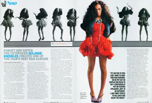

Her posture shows the innocence that she may have with the hand behind her back, but this may also represent a slight confidence. The artists name being in blue draws the reader’s attention to that section, because the name contrasts against the white background and black writing. This is so that the audience will instantly know who this article will be about.

The pictures represented along the top of the double page spread, allows the reader to get an insight into the artists personality, which will put the reader at ease with the artist. It shows the fun, lively, and creative side of the artist, but also a bit of her background on her.

The audience will also be attracted to the artist from the middle, main photograph. This is because the fact she is wearing red, stands out from the black and white colour of the background, which helps her stand out a lot more, catching the reader’s eye instantly. The connotations of the colour red, is romance, love, fire, sexiness all of which may represent her personality. What she is wearing also shows that she is a modern artist because she is fashionable with today’s trends, which will attract a lot of the younger audiences, as she is keeping in with this generation’s style. Most young women like to be up to date with what celebrities are wearing, and the latest trends in the different seasons etc. therefore this also explains to the reader that she is highly professional, and sophisticated by keeping with the right dress styles for certain scenarios.

The fact that there is a section of text in bold, right next to the artists legs, in black writing with a much larger font, helps it stand out more. It is attracting the reader to the main source, and the more important parts of the text. Many of the younger audience maybe attracted to her legs in prone of jealousy, or admiration etc. therefore this text may have also been placed here specifically, because they know that the readers will be looking at the bright photograph first as it catches their eye, rather than going straight into the context.

The artist is making direct eye contact with the audience, also known as the ‘direct mode of address’, therefore it is drawing attention of the reader, into the article, because it is as if the artist is addressing you personally. This will put the reader at ease with the artist.

Sunday 14 October 2012

Analysis of 2 Music Mag Covers


Analysis of two front covers

VIBE Analysis:


Target Audience - The target audience for the VIBE magazine would be the people aged between 16 and 30, because they are the people who enjoy this generations R&B artists and music which the magazine advertise and are not affected by the use of explicit material etc. in this type of music and the information in the VIBE magazine itself. Adults and children would not be interested within this boundary of entertainment, as it doesn't fit within their genertaion or time.  For example: Chris Brown, who is promoted as the feature article photograph relates to the 16 - 30 audience, as he is an R&B artist who fits into their generation and age group. Young adults look up to the aspiring pop artists of today as role-models, therefore VIBE are followed by a much younger audience so that the audience can follow in their footsteps, or simply catch up on the latest gossip involving R&B celebrities. Aswell as this, most R&B artists of today are either in their teenage years themselves or just above, so the younger audience can realate to their background etc. as they are of a similar age.

Mast Head - The mast head begins from the top left, as people begin to read from that side. The font is large and bright, with a luminous white colour so it will be extremly visible and attractive to the reader. The letters which spell out VIBEm is displayed in bubble writing to comprehend with the target audience (younger generation) so that the audience knows that it relates to them. The title is almost entirely covered by one of the top R&B artists 'Chris Brown' because he is a dominant R&B artist and is highly popular internationally, which will attract the reader from a shop window/shelf as it is what the reader will spot first. Both VIBE and Chris Brown mixed together on one cover will attract audiences alike, as they are both well-known and relate to each other.

Price - The price on the VIBE magazine is centred on the barcode, however it is presented small. This is because the company are a popular brand and will not want to attract the reader instantly to the price, if it is too high. It might not meet the expectations of the buyer, therefore VIBE would lose out on a lot of the magazines main/key audience.

Feature Article Photograph - VIBE immediately clarify that Chris Brown is the main article of the magazine, because he has his own large advertisement (photograph) as the front cover. The reader is informed instantly that Chris Brown is the main topic, because it stands out the most above the rest of the information and images etc. which is given on the front cover. The photograph will attract multiple teenage boys/girls to the image and the magazine, as Chris Brown is known to be highly popular amongst younger audiences with his latest songs and image. This will leave the reader engaged, as their favourite R&B artist is the main article of a a popular magazine, therefore it shows that it must be worth something if an extremely famous artist is presented on the front cover. This will make the reader want to purchase the magazine as Chris Brown is focused as the main protagonist of the front page and the feature article photograph. The photograph would especially attract the teenage girl sector of the audience as he could be, e.g. an idol, or teenage celebrity crush. To contrast with RnB's different artist backgrounds, some weeks, VIBE choose to show R&B women artists as their front cover and others of the men. This explains to the reader that VIBE's main audience isn't based on just one particular gender, as they use both male and female artists each week to please both, and ultimately explains to the reader that their magazines are not gender-biased.

Main Cover Line - The main cover line for the VIBE magazine is the text that reads 'IS THAT CHRIS BROWN?' which will attract the audience almost instantly. This is because Chris Brown is one of the most influencial and famous R&B artists of our generation, therefore VIBE would know that this would make a big impact on their fans sales. The words stand out a great deal, in some-ways it is more noticeable than the Mast Head. The main cover line is presented in the same colour as the Mast head so that they contrast well and do not clash. This could have also been done to explain to the reader that the article/topic involving Chris Brown is as dominant as the VIBE brand and title itself, therefore they choose to present this in the same colour as the title to display it's importance towards the magazine. The words 'CHRIS BROWN' are the overview of what the magazine will contain the most because it is presented as the main article, therefore the audience will know what to expect throughout the majority of the magazine.

Cover Line - The magazine gives a drop down list of cover lines all the way down the right-hand side of the front cover. An example of one of these would be 'Usher's exes'. This is extra information which is added onto the front cover, so that the reader can grasp a sense of what other storylines/features will be contained throughout the magazine. The word 'Usher' is presented in the colour Green to emphasize that it is to do with a famous celebrity (especially being R&B) and is displayed in this colour so that it stands out against the dark background, as the green is luminous.

Plugg - An example of a plugg from this magazine would be the quote towards the bottom left corner of the front cover which reads "I'M STILL A VIRGIN IN YOUR EYES..." This is a quote which continues on from the main cover line as it is a quote from Chris Brown related to the previous topic, with the reader being told this from the speech marks at each side and presented right underneath of the main cover line. This quote also features the word 'YOUR', however it is presented in italic writing to stand out and engage the reader to explain that it is involving the audiene in with the topic. The quote ends with an ellipsis, because the whole quote does not explain the full topic and will link to something else later on in the magazine so the reader would have to look inside to find out more, persuading them to purchase the magazine, concluding as the overall selling point.

Puffs - The front cover uses Puffs by using attractive and powerful words, such as: 'Rise', 'Fall', 'Mega', 'Best' and 'Debarge'. This will attract the reader as they make it sound as if VIBE is as dominant as the words and information that is used, which will persuade the reader to purchase the magazine.

Strapline - The strapline is at the very top of the front cover and explains more about the brand to promote it, by advertising extra information which is included with the magazine. For Example: 'COCAINE, HEROINE, PRISON, HIV... AND THE BEST LOVE SONGS OF THE 80's.' This is used to explain to the reader that there is more storylines, celebrities etc. which the magazine offers. For this issue, the strapline would be most beneficial to those who dislike Chris Brown who is promoted as the main article/photograph, because the reader is informed that there are more storylines and activities etc. that the reader can appreciate.

'RnB' Analysis:


Target Audience - The target audience for the 'RNB' magazine is somewhat different in comparison to the 'VIBE' magazine, as the front cover involves a more informal layout, without the use of Colloquial Language which was contained on the VIBE magazine, therefore 'RNB' is targeted at a more mature audience to the RNB genre. The front cover focuses more on the musical talent, rather than the celebrity gossip on the other magazine. The age range for the 'RNB' magazine would be aimed at a 20 - 40 audience, as they promote more of the legendary RNB artists which the younger generation will not be familiar with, rather than the VIBE magazine who promote fresh, unique talent on their front covers who the younger generation can relate to, like previously said 'RNB' focus more on the musical talent rather than the young celebrities, who always have a lot of gossip.
 

Mast Head - Unlike VIBE the 'RNB' Mast Head is presented right in the corner at the top left, rather than VIBE who filled up the whole top space of the magazine. The reason for this is because it is an extremly popular magazine company who will know that they are dominant, therefore they will not need to promote this with a large advertisement of their company name as people will already be familiar with it. The words which spell out 'RNB' are presented in a bright, red colour, unlike the VIBE magazines extremely 'white' colour, which showed lack of imagination as it was plain. The red will especially engage with men, as they are known to be heavily attracted to the colour red, therefore this may explain to the reader that their main audience maybe for specifically men, where as VIBE used a neutral, dull colour to represent that the magazine is for both genders. Also, the words 'RNB' are presented ragged and smooth to represent the layout, audience and genre. The Mast Head is also entirely visible to the reader, where as the VIBE magazine's Mast Head was half covered with a celebrity. This is an advantage as the title will more easily be sighted from a shop window/shelf.


Price - The price is not contained on the front cover which will mislead the reader into thinking that the magazine is cheap, however it probably won't be as it is a popular music company but it would not matter as the buyer would have purchased it already. VIBE displayed a price as the magazine was cheap, however 'RNB' have done this differently, probably because the price may be too expensive and will not meet the expectations of the buyer if it is sighted instantly on the front cover, which would lead to 'RNB' losing out on the magazines main/key audience.
 

Feature Article Photograph - 'RNB' immediately clarify that Kevin Mc call is the main article of the magazine because he has his own large advertisement, just like VIBE with Chris Brown. He stands out the most above the information that is given, which explains this even greater. The major difference between 'RNB' and VIBE is that 'RNB' have chose to present their photograph in Black and White to represent even more that the magazine is aimed at men, as men are not attracted to black and white imagery which creates a more 'manly' atmosphere towards the reader. VIBE chose to present their photograph in full colour, to promote the magazine as being aimed at both genders. Both 'RNB' and Kevin Mc call will attract audiences of a mature age, as they are both well-known to the older generation for their more formal R&B roles, which relate to each other.


Main Cover Line - The main cover line on the 'RNB' magazine is the text that reads 'Kevin Mc call' which consists of only two words, but will attract the target audiences instantly. This is because Kevin is an extremly well-known RNB artist of our time, therefore 'RNB' will know that this would make an impact with their fans and sales. The words are presented in red to coincide with the Mast head to represent it's importance to the magazine (also showing this with the block capitals), like VIBE have done, but 'RNB' have also done this to carry on the focus towards men. The writing is presented in Sans Serif to display the formal layout, and to match the proffesional tone of the front cover.
 
Cover Line - An example of a cover line would be from the text that reads 'Jeremih'. This is presented as extra information which is added on, so that the reader can grasp a sense of what else the magazine will involve and contain. Jeremih is a famous R&B artist, therefore readers will be engaged as they are focusing on more than just one famous celebrity.
 
Plugg - An example of a plugg would from the text which reads, "THE HIT MAKER...". 'RNB' have done the same as VIBE by using an ellipsis to persuade the reader to purchase magazine the magazine at an even higher extent, as they would have to purchase the magazine to find out more about that certain topic, especially when it involves very famous celebrities, which would conclude as the overall selling point.
 
Puffs - 'RNB' feature small puffs such as: 'Feel', 'Good', 'Beauty' and 'Premiere', however they do not feel as powerful as the ones which VIBE use, which ultimately suggests to the reader that the 'RNB's' advertising lacks the dominance which VIBES have, with the content and formal descriptions of 'RNB' being more thought about.

Strapline - The strapline is contained at the very top of the page (again) just like VIBE has done, which explains more about the brand, by promoting more information which the magazine contains. For example: 'Rooney Jerkins', 'Keith Sweat', 'Rhona Bennett', 'Sincere'. These are used to explain to the reader that the magazine contains information in regards to more than just one famous celebrity, overall attracting them more to the magazine as there is more gossip etc. which the reader can pursue. For this strapline it would be beneficial to the people who dislike Kevin Mc call, who is promoted as the main article, because the reader is informed that there are many other storylines etc. that he/she can appreciate.

Friday 12 October 2012

Research Unit - Questionnaire

For my target audience I used Primary Research by conducting a questionnaire to ask my fellow peers how they felt about music magazines. Six questions were used, with of all of them answered fully efficient and when the results came to a conclusion it was found that all of the participants chose similar answers, so I can use these results for my target audience, etc. for my Music magazine which is crucial so that I can decide overall how I want my final peice to look like. I have had help from teenagers themselves who the RnB genre and my music magazine relates to the most, so it has helped me define more about how the magazine should be dealt with from the questions below. The questionnaire has also allowed me to gather information that cannot be found elsewhere, e.g. in Secondary Research, as it is fresh, unique and from the target audiences perspective. It has also defined the customers attitude/awareness/likely performance and buying behaviour towards the proposed product, making the results overall reliable.

To present these results I chose to use quantative data, using Microsoft Excel to conduct a pie chart so that the results were made clear to show the size of the items in one data series. This was so that I could specify this information for if and when I need it and give each question a total to tally them up and see which ones are most relevant to the magazine. The results are also lined up in order so that it is easier for me to understand and compare the results with each other to see the increase and decrease etc. between each question for the benefit of the magazine.


Music Magazine Questionnaire
Give a tick next to your answer to represent Yes or No:      

1.       What type of music magazine genre would fascinate you the most?


-          Rock      

-          Pop


-          R n B


-          Indie


-          Other (Type in the genre on the line below) ___________________________________________________________________


2.        From the question above, why would you choose this particular Genre?


3.       What do you look for in a Music Magazine? For example: The celebrity insiders, Images, Talented musicians etc. If so, explain why?


4.       How often do you read Music Magazines?

-          Everyday
-          Weekly


-          Monthly


-          Never


            Other …  _________________________________________________________________


5.       What Colours fascinate you the most in a Music magazine? Also explain why.


6.       How much are you willing to spend on a Music magazine?


£1 - £3


£3 - £5


£5 - £7


£7 - £9


£9- £10


Other … ____________________________________________________________________