Friday 26 October 2012

Production Company name/ logo/ profile


Production Company Name: 'RV' publishers - The reason why I have chosen to name my production company 'RV' is because it is my initials, therefore it will be easy to remember for my benefit and it also relates to me who controls the magazine as a whole. The initials have been used to conceal the gender as some of the public tend to be gender-biased, therefore to the reader the initials could represent either a man or a woman so that the magazine does not display favoritism etc. I have also chosen this name because it is short and sweet and will not take up much writing on my front cover and will aid the readers memory as it only consists of two words, therefore it will be easier to pick up and remember.

Logo Examples:
 
R.V  R.V  R.V

Tuesday 23 October 2012

Analysis of 2 Contents Pages


VIBE
Contents Page 1:


The contents page is presented in black and grey, for that reason it will attract attention to any audience as the colour is plain and neutral, as it is not specifically aimed towards one particular audience. In the background of the contents page there stands a huge ‘V’ to represent the magazine ‘VIBE’, which is very effective as it will catch the audiences eye from the size and emphasizes that the contents page is about all the things involving ‘VIBE’ and advertises the brand even more. Furthermore, the colours that are chosen go well with the genre of music, as R&B is vintage music and Kanye West’s appearance is as well, so it keeps in with the style.

Kanye West is presented as the main protagonist of the contents page as he has his own, large photograph, dominating the whole page, explaining to the reader that he is the centre of attention as it extremely large, so that it catches the reader’s eyes instantly. It is big and stands out due to the size and colour of the picture. The photograph of him has been edited into black and grey, to contrast with the background. There is an arm which folds over the artist’s arm, ending with a red heart in her palm upon his chest, which gives the audience a feel of what Kanye West maybe like in reality, and the majority of the page is in blue or grey and the heart is coloured in red therefore it stands out well and will attract with the reader.  The connotations of the colour represent romance and sex appeal, which also explains that this maybe a side of his personality. The artist is making clear eye-contact with the audience, this is known as ‘direct mode of address’, as it is drawing the audience in because it is almost as if the artist is addressing you personally. He looks stern and edgy, which may reflect on the personality of this magazine. The fact that he has his hands in his pockets gives a laid back approach and shows he has confidence in himself, which may also make the reader feel laid back and at ease with the magazine, even though he looks edgy and stern. Although all the colours blend in with the background, it is affective because you can clearly identify the artist. Also, the jacket that he is wearing clearly stands out which will draw the reader’s attention up to the artists face.

The title ‘contents’ is presented oddly, however it will be affective to the reader as it shows creativity and explains to the reader that the magazine is imaginative. It will also be attractive because it is bold, and makes a statement as it is in capital letters. The bold blackness of the text links in with the theme of the page, which is grey and black.

The list of where to find pages or articles is on the right hand side, presented in a fairly big, black font, making it easier for the reader to read. The instructions that it gives you are objectively simple, as it tells you what the article involves and then gives a number for the page to find it on. It also features some sub-sections, for example: Features and Fashion. This helps to make navigation simpler, as the reader can find what they want much easier. In the bottom right hand corner of the page, there are a couple of bullet points (illustrations) explaining the pictures on the front cover and also the contents page. It tells you the artist’s name and where the picture was taken, etc.

The font of the sub text is very laid back, the headings are flowing which will draw the reader’s attention to them which will lead them on to the important information underneath.

The way in which the writing is on the left hand side of the page is affective because the last thing that the audience will read is anything on the right hand side of the page, because they read from the left to right, therefore they will be left with the information as to what’s on the different pages.
 

Contents Page 2:
 
This is another Contents page from the R&B magazine 'Vibe'. R&B magazines have a different approach towards women than most other music genres and this is shown on this page, as R&B music is very much orientated towards sexual women and appearance, with the image being used on this page representing this. The image of the music artist 'Ciara' is used as she is a very popular artist in the R&B industry, and this could attract more readers. Her minimal clothing, sexual pose and high heels add to the R&B music stereotypes, and display sex appeal. Vibe magazine is read by both male and female from a teenage age upwards. This image used can appeal to both male and female in many different ways, and explains to the reader that the magazine is not gender-biased. For example: Women may look at this image to idolise Ciara, and her appearance etc. and men may look at this image to admire Ciara, etc.
The layout of this contents page is detailed but basic, with just a faded grey background and black and white text. Everything is very easy to read, as it is informal and the font is quite small, but everything has a heading and the layout of 'Contents' is big, bold and white to stand out. Ciara's clothes and the colour scheme of the whole contents page match to make the magazine more formal.
The outline of the ‘V’ on the page represents and ties in with the whole magazine, with the magazine being called ‘VIBE’. The ‘V’ stands out from the background but doesn’t overpower the title to represent what the page is about, so it does not attract unwanted attention.
The artist’s legs lead up to the title of the page which is affective, because although her legs may attract people to this page as the connotations are promiscuous etc. it still conveys meaning as to why they are upwards, leading towards the ‘CONTENTS’ as it draws the reader’s eyes up to the main object of the page.
The artists outfit also links in with the colours of the contents page, which does not take too much attention away from the contents of the page. The artist is also making very clear eye-contact with the audience, and (again) displays the ‘direct mode of address’, which will draw the reader into the magazine even more.  The eye-contact is quite unassuming and mysterious which will instantly attract the reader.
The page is informative, and it is easy to read as to what the magazine will contain. The main headings are in a flowing font which makes it stand out from the rest of the text, because the rest is bold text. This helps to direct the reader into whatever he/she may want to read. The fonts are informal which will put the reader at ease and it also contrasts against the mast head.
The title of the pages stand out which will attract the audience, it also informs the reader as to what the page will consist of. The font is bold and in capital letters, which will draw more attention to the title.

Friday 19 October 2012

Analysis of 2 different articles

 
This is a double page spread taken from the music magazine ‘Q’, who are advertising the Black Eyed Peas, one of R&B’s most iconic music groups.

Immediately, the image will draw the reader’s attention because it takes up two thirds of the entire two pages. The organisation of the features such as the column of writing is clear to see, as well as the writing, because it isn’t too large and doesn’t take up a vast quantity so it therefore allows for more written information to be put into the column, and the black coloured font is also a contrast of the white background and hence helps to stand out to the reader, attracting their attention. This is so that when they read the article, the simple type of font makes it even easier to read. The affect overall is that the audience will feel more comfortable when reading the article, as there are less complications involved than there would be without the contrasting colours and simple fonts, etc. and hence this will reel in the audience to read this article.

A disadvantage to this article wouble be that the image crosses over the fold of the page and the image is cut off and cannot be fully viewed by the audience, and this can put off the audience as they prefer to see a full image rather than seeing half of an image. The design of putting the image over the centrefold of the page was a poor decision.

The colour scheme on the double page spread is clear to identify with a mix of gold, black and white with other similar colours like beige and light grey, which are located across the page in images, writing and headings and created images. This could signify the bands rich and famous lifestyle, and the colour gold could also have the connotation of the band’s wealth, good health, success and personal power.

The image of the Black Eyed Peas has a different variaty of  colours, with Will.I.Am wearing black, white, beige and grey which contrast and compliment each other at the same time. This gives away a connotation to the reader that will.I.am is more important than the other members. This is because he is standing in front of the other members, whilst the other members stand behind him, slightly faded. He has the most successful solo career out of the entire group, after collaborating with many successful, multi-platinum artists such as Cheryl Cole, Britney Spears, etc. which may further explain this.

The colours certainly stand out as striking and different which will catch the eye of the audience, but these colours also look good together as they make the other colours stand out too, further making the page lively, and ebullent. Also, the white background helps to make the characters stand out as they are wearing strong colours, and the overall effect is that they are the main feature on the page which will draw attention.

The header and pull quote have a very ‘futuristic’ feel due to the gold and the chrome colours. These colours contrast massively with the plain white text box that caresses it. Also, the pull quote has a highly robotic appearance and further reflects the futuristic look. The plain white background gives the page a simplistic and quite ‘empty’ feel, which further adds to the futuristic look on things. However, the plain white background could also be a denotation; the colour white symbolises purity and the Black Eyed Peas’ material is always written and produced by their selves (in particular will.i.am, who is at the front of the feature image) and hence, is ‘pure’ as everything the group sing is true to themselves.


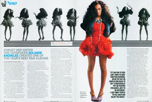
Her posture shows the innocence that she may have with the hand behind her back, but this may also represent a slight confidence. The artists name being in blue draws the reader’s attention to that section, because the name contrasts against the white background and black writing. This is so that the audience will instantly know who this article will be about.

The pictures represented along the top of the double page spread, allows the reader to get an insight into the artists personality, which will put the reader at ease with the artist. It shows the fun, lively, and creative side of the artist, but also a bit of her background on her.

The audience will also be attracted to the artist from the middle, main photograph. This is because the fact she is wearing red, stands out from the black and white colour of the background, which helps her stand out a lot more, catching the reader’s eye instantly. The connotations of the colour red, is romance, love, fire, sexiness all of which may represent her personality. What she is wearing also shows that she is a modern artist because she is fashionable with today’s trends, which will attract a lot of the younger audiences, as she is keeping in with this generation’s style. Most young women like to be up to date with what celebrities are wearing, and the latest trends in the different seasons etc. therefore this also explains to the reader that she is highly professional, and sophisticated by keeping with the right dress styles for certain scenarios.

The fact that there is a section of text in bold, right next to the artists legs, in black writing with a much larger font, helps it stand out more. It is attracting the reader to the main source, and the more important parts of the text. Many of the younger audience maybe attracted to her legs in prone of jealousy, or admiration etc. therefore this text may have also been placed here specifically, because they know that the readers will be looking at the bright photograph first as it catches their eye, rather than going straight into the context.

The artist is making direct eye contact with the audience, also known as the ‘direct mode of address’, therefore it is drawing attention of the reader, into the article, because it is as if the artist is addressing you personally. This will put the reader at ease with the artist.

Sunday 14 October 2012

Analysis of 2 Music Mag Covers


Analysis of two front covers

VIBE Analysis:


Target Audience - The target audience for the VIBE magazine would be the people aged between 16 and 30, because they are the people who enjoy this generations R&B artists and music which the magazine advertise and are not affected by the use of explicit material etc. in this type of music and the information in the VIBE magazine itself. Adults and children would not be interested within this boundary of entertainment, as it doesn't fit within their genertaion or time.  For example: Chris Brown, who is promoted as the feature article photograph relates to the 16 - 30 audience, as he is an R&B artist who fits into their generation and age group. Young adults look up to the aspiring pop artists of today as role-models, therefore VIBE are followed by a much younger audience so that the audience can follow in their footsteps, or simply catch up on the latest gossip involving R&B celebrities. Aswell as this, most R&B artists of today are either in their teenage years themselves or just above, so the younger audience can realate to their background etc. as they are of a similar age.

Mast Head - The mast head begins from the top left, as people begin to read from that side. The font is large and bright, with a luminous white colour so it will be extremly visible and attractive to the reader. The letters which spell out VIBEm is displayed in bubble writing to comprehend with the target audience (younger generation) so that the audience knows that it relates to them. The title is almost entirely covered by one of the top R&B artists 'Chris Brown' because he is a dominant R&B artist and is highly popular internationally, which will attract the reader from a shop window/shelf as it is what the reader will spot first. Both VIBE and Chris Brown mixed together on one cover will attract audiences alike, as they are both well-known and relate to each other.

Price - The price on the VIBE magazine is centred on the barcode, however it is presented small. This is because the company are a popular brand and will not want to attract the reader instantly to the price, if it is too high. It might not meet the expectations of the buyer, therefore VIBE would lose out on a lot of the magazines main/key audience.

Feature Article Photograph - VIBE immediately clarify that Chris Brown is the main article of the magazine, because he has his own large advertisement (photograph) as the front cover. The reader is informed instantly that Chris Brown is the main topic, because it stands out the most above the rest of the information and images etc. which is given on the front cover. The photograph will attract multiple teenage boys/girls to the image and the magazine, as Chris Brown is known to be highly popular amongst younger audiences with his latest songs and image. This will leave the reader engaged, as their favourite R&B artist is the main article of a a popular magazine, therefore it shows that it must be worth something if an extremely famous artist is presented on the front cover. This will make the reader want to purchase the magazine as Chris Brown is focused as the main protagonist of the front page and the feature article photograph. The photograph would especially attract the teenage girl sector of the audience as he could be, e.g. an idol, or teenage celebrity crush. To contrast with RnB's different artist backgrounds, some weeks, VIBE choose to show R&B women artists as their front cover and others of the men. This explains to the reader that VIBE's main audience isn't based on just one particular gender, as they use both male and female artists each week to please both, and ultimately explains to the reader that their magazines are not gender-biased.

Main Cover Line - The main cover line for the VIBE magazine is the text that reads 'IS THAT CHRIS BROWN?' which will attract the audience almost instantly. This is because Chris Brown is one of the most influencial and famous R&B artists of our generation, therefore VIBE would know that this would make a big impact on their fans sales. The words stand out a great deal, in some-ways it is more noticeable than the Mast Head. The main cover line is presented in the same colour as the Mast head so that they contrast well and do not clash. This could have also been done to explain to the reader that the article/topic involving Chris Brown is as dominant as the VIBE brand and title itself, therefore they choose to present this in the same colour as the title to display it's importance towards the magazine. The words 'CHRIS BROWN' are the overview of what the magazine will contain the most because it is presented as the main article, therefore the audience will know what to expect throughout the majority of the magazine.

Cover Line - The magazine gives a drop down list of cover lines all the way down the right-hand side of the front cover. An example of one of these would be 'Usher's exes'. This is extra information which is added onto the front cover, so that the reader can grasp a sense of what other storylines/features will be contained throughout the magazine. The word 'Usher' is presented in the colour Green to emphasize that it is to do with a famous celebrity (especially being R&B) and is displayed in this colour so that it stands out against the dark background, as the green is luminous.

Plugg - An example of a plugg from this magazine would be the quote towards the bottom left corner of the front cover which reads "I'M STILL A VIRGIN IN YOUR EYES..." This is a quote which continues on from the main cover line as it is a quote from Chris Brown related to the previous topic, with the reader being told this from the speech marks at each side and presented right underneath of the main cover line. This quote also features the word 'YOUR', however it is presented in italic writing to stand out and engage the reader to explain that it is involving the audiene in with the topic. The quote ends with an ellipsis, because the whole quote does not explain the full topic and will link to something else later on in the magazine so the reader would have to look inside to find out more, persuading them to purchase the magazine, concluding as the overall selling point.

Puffs - The front cover uses Puffs by using attractive and powerful words, such as: 'Rise', 'Fall', 'Mega', 'Best' and 'Debarge'. This will attract the reader as they make it sound as if VIBE is as dominant as the words and information that is used, which will persuade the reader to purchase the magazine.

Strapline - The strapline is at the very top of the front cover and explains more about the brand to promote it, by advertising extra information which is included with the magazine. For Example: 'COCAINE, HEROINE, PRISON, HIV... AND THE BEST LOVE SONGS OF THE 80's.' This is used to explain to the reader that there is more storylines, celebrities etc. which the magazine offers. For this issue, the strapline would be most beneficial to those who dislike Chris Brown who is promoted as the main article/photograph, because the reader is informed that there are more storylines and activities etc. that the reader can appreciate.

'RnB' Analysis:


Target Audience - The target audience for the 'RNB' magazine is somewhat different in comparison to the 'VIBE' magazine, as the front cover involves a more informal layout, without the use of Colloquial Language which was contained on the VIBE magazine, therefore 'RNB' is targeted at a more mature audience to the RNB genre. The front cover focuses more on the musical talent, rather than the celebrity gossip on the other magazine. The age range for the 'RNB' magazine would be aimed at a 20 - 40 audience, as they promote more of the legendary RNB artists which the younger generation will not be familiar with, rather than the VIBE magazine who promote fresh, unique talent on their front covers who the younger generation can relate to, like previously said 'RNB' focus more on the musical talent rather than the young celebrities, who always have a lot of gossip.
 

Mast Head - Unlike VIBE the 'RNB' Mast Head is presented right in the corner at the top left, rather than VIBE who filled up the whole top space of the magazine. The reason for this is because it is an extremly popular magazine company who will know that they are dominant, therefore they will not need to promote this with a large advertisement of their company name as people will already be familiar with it. The words which spell out 'RNB' are presented in a bright, red colour, unlike the VIBE magazines extremely 'white' colour, which showed lack of imagination as it was plain. The red will especially engage with men, as they are known to be heavily attracted to the colour red, therefore this may explain to the reader that their main audience maybe for specifically men, where as VIBE used a neutral, dull colour to represent that the magazine is for both genders. Also, the words 'RNB' are presented ragged and smooth to represent the layout, audience and genre. The Mast Head is also entirely visible to the reader, where as the VIBE magazine's Mast Head was half covered with a celebrity. This is an advantage as the title will more easily be sighted from a shop window/shelf.


Price - The price is not contained on the front cover which will mislead the reader into thinking that the magazine is cheap, however it probably won't be as it is a popular music company but it would not matter as the buyer would have purchased it already. VIBE displayed a price as the magazine was cheap, however 'RNB' have done this differently, probably because the price may be too expensive and will not meet the expectations of the buyer if it is sighted instantly on the front cover, which would lead to 'RNB' losing out on the magazines main/key audience.
 

Feature Article Photograph - 'RNB' immediately clarify that Kevin Mc call is the main article of the magazine because he has his own large advertisement, just like VIBE with Chris Brown. He stands out the most above the information that is given, which explains this even greater. The major difference between 'RNB' and VIBE is that 'RNB' have chose to present their photograph in Black and White to represent even more that the magazine is aimed at men, as men are not attracted to black and white imagery which creates a more 'manly' atmosphere towards the reader. VIBE chose to present their photograph in full colour, to promote the magazine as being aimed at both genders. Both 'RNB' and Kevin Mc call will attract audiences of a mature age, as they are both well-known to the older generation for their more formal R&B roles, which relate to each other.


Main Cover Line - The main cover line on the 'RNB' magazine is the text that reads 'Kevin Mc call' which consists of only two words, but will attract the target audiences instantly. This is because Kevin is an extremly well-known RNB artist of our time, therefore 'RNB' will know that this would make an impact with their fans and sales. The words are presented in red to coincide with the Mast head to represent it's importance to the magazine (also showing this with the block capitals), like VIBE have done, but 'RNB' have also done this to carry on the focus towards men. The writing is presented in Sans Serif to display the formal layout, and to match the proffesional tone of the front cover.
 
Cover Line - An example of a cover line would be from the text that reads 'Jeremih'. This is presented as extra information which is added on, so that the reader can grasp a sense of what else the magazine will involve and contain. Jeremih is a famous R&B artist, therefore readers will be engaged as they are focusing on more than just one famous celebrity.
 
Plugg - An example of a plugg would from the text which reads, "THE HIT MAKER...". 'RNB' have done the same as VIBE by using an ellipsis to persuade the reader to purchase magazine the magazine at an even higher extent, as they would have to purchase the magazine to find out more about that certain topic, especially when it involves very famous celebrities, which would conclude as the overall selling point.
 
Puffs - 'RNB' feature small puffs such as: 'Feel', 'Good', 'Beauty' and 'Premiere', however they do not feel as powerful as the ones which VIBE use, which ultimately suggests to the reader that the 'RNB's' advertising lacks the dominance which VIBES have, with the content and formal descriptions of 'RNB' being more thought about.

Strapline - The strapline is contained at the very top of the page (again) just like VIBE has done, which explains more about the brand, by promoting more information which the magazine contains. For example: 'Rooney Jerkins', 'Keith Sweat', 'Rhona Bennett', 'Sincere'. These are used to explain to the reader that the magazine contains information in regards to more than just one famous celebrity, overall attracting them more to the magazine as there is more gossip etc. which the reader can pursue. For this strapline it would be beneficial to the people who dislike Kevin Mc call, who is promoted as the main article, because the reader is informed that there are many other storylines etc. that he/she can appreciate.

Friday 12 October 2012

Research Unit - Questionnaire

For my target audience I used Primary Research by conducting a questionnaire to ask my fellow peers how they felt about music magazines. Six questions were used, with of all of them answered fully efficient and when the results came to a conclusion it was found that all of the participants chose similar answers, so I can use these results for my target audience, etc. for my Music magazine which is crucial so that I can decide overall how I want my final peice to look like. I have had help from teenagers themselves who the RnB genre and my music magazine relates to the most, so it has helped me define more about how the magazine should be dealt with from the questions below. The questionnaire has also allowed me to gather information that cannot be found elsewhere, e.g. in Secondary Research, as it is fresh, unique and from the target audiences perspective. It has also defined the customers attitude/awareness/likely performance and buying behaviour towards the proposed product, making the results overall reliable.

To present these results I chose to use quantative data, using Microsoft Excel to conduct a pie chart so that the results were made clear to show the size of the items in one data series. This was so that I could specify this information for if and when I need it and give each question a total to tally them up and see which ones are most relevant to the magazine. The results are also lined up in order so that it is easier for me to understand and compare the results with each other to see the increase and decrease etc. between each question for the benefit of the magazine.


Music Magazine Questionnaire
Give a tick next to your answer to represent Yes or No:      

1.       What type of music magazine genre would fascinate you the most?


-          Rock      

-          Pop


-          R n B


-          Indie


-          Other (Type in the genre on the line below) ___________________________________________________________________


2.        From the question above, why would you choose this particular Genre?


3.       What do you look for in a Music Magazine? For example: The celebrity insiders, Images, Talented musicians etc. If so, explain why?


4.       How often do you read Music Magazines?

-          Everyday
-          Weekly


-          Monthly


-          Never


            Other …  _________________________________________________________________


5.       What Colours fascinate you the most in a Music magazine? Also explain why.


6.       How much are you willing to spend on a Music magazine?


£1 - £3


£3 - £5


£5 - £7


£7 - £9


£9- £10


Other … ____________________________________________________________________


Research Institutions - Distributers and Publishers

IPC Media:
 
International Publishing Company IPC Media is one of the United Kingdom's leading consumer magazine and digital publishers, with
a large portfolio selling over 350 million copies each year. IPC Media Music magazines are dedicated to music and music cultures featuring many different famous musicians, but also new musicians that specialize in certain types of music. In the majority the music magazines focus on one genre although as well they do focus on the closest other music to this genre which they also include features, up and coming and profiles on artists. For example if they choose Rihanna she could be represented in a pop or an R&B magazine so she would span across two different genres. Also each of the different genres of music attracts certain types of audiences. The magazines need to relate to the target audience and this also relates to the whole content and style of the magazine as well. It has an age difference for their audience from Teenagers through to mid-twenties and also by gender so this is often a very difficult for magazines to appeal to their entire readership with exactly what they want to appear and feature within the publications. More and more the music magazines are featured heavily on-line and through different digital and social media channels as well, as their target audience are now choosing multi-media channels to access information.
IPC Media groups titles under five magazine divisions: Connect (women's weeklies such as Now Magazine and Look), Inspire (leisure and specialist), Ignite! (men's lifestyle and entertainment), SouthBank (women's lifestyle and home interest) and TX (portfolio of television titles). In addition, there is Marketforce, the UK's leading magazine distribution business. Digitally they have WOTV and goodtoknow. International Publishing Company.

The Music Magazines which they own are: NME and Guitar and Bass International Publishing Company

                                   Bauer Media Group:

Bauer Media Group Is a large German publishing company based in Hamburg, which operates in 15 countries worldwide. Since the company was founded in 1875, it has been privately-owned and under management by the Bauer family. It was formerly called Heinrich Bauer Verlag KG.
The Music Magazines this publisher provides are: Q MOJO and KERRANG. All three are advertised on their website as being men’s magazines. Bauer Media Group.

Emap was the second largest magazine publisher in the UK with about 18% of the news-stand market by revenue (to IPC/Time Warner's 20%). However, in July 2007, the company announced a strategic review. The result was that the company was split up and sold off in December: The business-to-business magazines were sold to Guardian Media Group and private equity firm Apax - which owns Incisive - for £1bn. The new company is to be called Incisive-Emap, its consumer magazines and radio arm, including Kiss and Magic, went to Bauer for £1.14 billion - making the German magazine publisher the largest in Britain.

Development Hell Ltd Set up by ex-Emap executives David Hepworth, Jerry Perkins, Mark Ellen and Andrew Harrison. Business plan to launch three magazines over six years. First launch, in March 2003, was Word , focusing on music and entertainment: New! Something to read! screamed the cover. Bought clubbing magazine Mixmag from Emap in November 2005. The Guardian Media Group took a 14% share in the company in July 2004.

BBC magazine is the magazine publishing arm of the BBC worldwide. BBC provides a varied and wide range of magazines that target many different audiences. They focus their magazines on music, gardening, children’s popular TV programmes, cooking, cars and astrology.
The music magazines that the BBC has published include: Its Hot - Top of The Pops - Classical Music Magazine

The BBC publishes many different genres of magazines as well as major websites through their digital channels as well. There are only a few magazines that are of the same genre. Top of the Pops attracts age ranges from 11 up to 15 years due to the content, music articles such as ‘Glee’ and ‘X Factor’. TOTP – affectionately known was launched in February 1995 and is released in magazine style monthly, but now has a new website which is updated every day with new ‘Today’s News’ section and new features. The magazine concentrates on chart music and features and focuses more on the commercial groups. It was closely linked to the TV show ‘Top of The Pops’ which was all about the music that was currently in the charts and everyone who is into the chart music and that culture. The magazine and the website also feature interactive articles and competitions to win musical related prizes, posters and pop memorabilia of star personas.

Future plc:

The future plc creates high-quality multi-media products which are used to reach their audiences online, on mobile and in print. Future attracts more than 45 million unique visitors a month online and is one of the world’s leading publishers on tablets such as the Apple iPad. Future delivers compelling content across five core sectors: Technology, Entertainment & Video Games, Sport & Auto, Music and Creative. The magazine is also famous for combining award-winning editorial with outstanding design, for their video content and digital know-how.

They also base everything that they do on communities of enthusiasts who are passionate about their interests. From computer games to film, from cycling to music-making, from photography to fast cars, they provide magazines, websites, multimedia content and events that inform, entertain and unite these communities. Their aim is to be the number one provider of trusted editorial services for enthusiasts in every one of our specialist sectors, and to be the number one partner of the companies who want to do business with these enthusiasts. They share the same passions as our consumers. These insights and our expertise are helping us to build and exploit our market-leading positions across different platforms in all of the core sectors in which we operate.

The company is also an international special-interest media group that is listed on the London Stock Exchange which was Found in 1985 with one magazine, today the company has operations in the UK, US and Australia creating over 180 special-interest publications, websites and events for people who are passionate about their interests.

Future plc is committed to ensuring that it conducts its business in a way that is environmentally, ethically and socially responsible. Corporate responsibility is inextricably linked to the reputation and commercial performance of the business.

Corporate responsibility is integral to the way Future plc conducts its business.  They focus their efforts around four key areas which they think can make a difference:
  • The environment
  • Our people
  • The community
  • Coorporate practice
Future plc has most recently won the awards of:

AOP Consumer Digital Publisher of the Year 2012
PPA Digital Consumer Publisher of the Year 2012


Thursday 11 October 2012

Audience Expectations - R&B Magazine

Sell lines, call outs and puffs - These are the key aspects to an RnB magazine, this is because it is one of the first things that the buyer is drawn to when sighting the magazine on a shop shelf, etc. This is particularly popular with my target audience as even the slightest bit of information surrounding famous celebrities would draw them in instantly, as my audience is aimed at the younger generation who are attracted to the latest gossip etc. For example: 'Win a FREE Chris Brown CD!' would attract the specific audience to the magazine because it is showing the readers that they can win something from purchasing this magazine. Also, Chris Brown's area within the pop industry is significantly high and is a very popular artist to the younger generation (especially teenage girls) so if they see that he is featured in the magazine then they are more likely to purchase it as he maybe a e.g. Teenage celebrity crush. This would conclude as the overall selling point.

RnB magazines usually like to use celebrities hobbies as their articles, so there could also be an attractive call-out which may read 'Rihanna's top ten must-haves' which could be presented in a bright, bold luminous colour. This would draw the reader in because they are discovering celebrities hidden secrets etc, which would persuade them to purchase the magazine at an even higher extent, particularly because Rihanna is one of the most influencial, famous pop artists of the 21st Century. This, and also that the title is presented bright etc. so it will catch the readers eyes instantly as it stands out from the background due to the wrtitng being a different colour to the box colour.

RnB magazines also tend to use specific RnB artists as their main storylines, to promote their magazine. An example of this could be from a sell line which reads ‘USHER FANS! Usher’s newsingle Boyfriend is out now!’ that would make the readers (and Usher fans especially) feel instantly involved, therefore convincing them to purchase the magazine as the topic relates to them the most and have even used their specific name  in the magazine to promote this and attract them to it as it is who they are known as.

There could also be a sell line which reads ‘Katy Perry: I have a huge crush on Will.I.Am!”. This makes the reader feel like they are getting really good/juicy gossip by placing the words ‘huge’ and ‘crush’ together, which suggests to the reader that this is a big deal and then feel like they need/want to know the full story, therefore forcing them to buy the magazine, so it is almost as if the magazine has done this on purpose.

Mast Head - The masthead of an RnB magazine has a huge impact in attracting and addressing my audience, specifically if they are presented large, in capitals or bold writing and clear for everyone to see. These are the first things that the audience sight eye-contact with and will see when purchasing or looking at the magazine as it is the largest, displayed item on the page so it will draw the reader in well. The title of the front cover should be the biggest and boldest as it stands out from all the other features. To have the title as the largest font is important as the readers need to know what the magazine is called for future reference and to make sure that they are buying the correct magazine. You could attract the audience through a title such as: ‘We love RnB’ as it means the reader can immediately understand that it is an RnB magazine and relates to all of their favourite RnB artists within this genre. This a key concept to attracting my audience as it allows them to know that this magazine holds literally all of the information which is related to their favourite music genre that they could want to fufill.

Mast Heads with the Double Page Spread - Mastheads can be used for the double page spread in an RnB magazine which would help to attract the reader as it is a pull quote and is written in direct quotations. This immediately gives the reader some information about the article before the readers actually read it themselves and tells them that it is for example: an interview. This is also useful so that the reader can sense whether the specfic article which is promoted is within their interest. By using different colours in the title it adds a big attraction for the audience and makes the page look more interesting and thought-provoked. An example of a title used for a contents page could be: ‘What’s inside...’ which is eye-catching and attracting for the audience not only because of the big writing and bright colours but also because it includes an ellipsis. This effectively makes the reader move onto the further features of the page whereas if it didn’t have it they would generally just skip the page.

Codes and Conventions - R&B Magazine

Mastheads - On R&B magazines, the mast head is usually presented towards the middle, rather than to the left, so that the artist overlaps the masthead. The masthead always stands out on R&B magazines, so that the consumers eye line should be drawn to this instantly before reading any other part of the front cover. For example: The red Q is found on all Q magazines, it always stands out from the background due to the writing being a different colour to the box colour. The masthead always has a relation for music in R&B magazines, e.g. ‘RnB' is a good example of this as it involves the word 'RnB' which is a well known genre of music and 'RnB' is also a well known genre of music internationally, and is presented Red on a White background to stand out.

Coverlines - The cover lines on an R&B magazine have some link to the featured artists of the magazine. The band or artist attracts the chosen target audience. The cover line from a 'RnB' magazine could have a reference to, for example: Rihanna, this will attract the audience as Rihanna is a huge R&B artist, so she relates to this specific genre and it's audience. It is usually presented bright and bold.

Background Image - Some R&B magazine conventions contain background images, which display a Band or an Artist who will please the target audience of the magazine. The artist in the R&B magazine etc. is the same genre of music as the magazine is, so that they contrast each other. For example: an R&B magazine which features BeyoncĂ© as a background image for an edition. Beyonce is a dominant female and attracts a huge audience, so even though she is not the feature article photograph, it will bring popularity to the magazine from audiences alike, because she is an R&B singer so she relates to the genre, and is a very famous artist.

Colour Scheme - R&B magazines are mostly aimed at both Males and Females, and is usually made clear on the front cover, so that the buyer is sure that the magazine is for him/her. The colours that they usually use are dark colours, such as: Dark Purple, Black and Dark Blue. This explains to the reader that the R&B genre of magazines are not gender-biased, as they are presented with dull colours, which in some ways would appeal to both genders as it is a mix of colours for both.

Title - The title of the magazine is usually repeated, including the date to prove that it is the latest version.

Colloqial Language - This type of language is found in most R&B magazines. This is to suit the target audience as it would usually suit a younger audience (for young adults), which an R&B magazine relates to the most.

Buzz words - These are used in R&B magazines order to attract attention, for example: "plus" and "free". These words will both influence the reader to want to buy that magazine, as there are other offers that the magazine contains, which will attract a wider audience as there is more that the reader can get out of it. This is especially popular in a R&B magazines because there is usually something extra engaging for the reader, for example: 'PLUS! Free insider on Ushers Personal life', which has used a buzz word to promote this. R&B magazines also tend to use symbols, such as: +, which would mean 'plus'. This also relates to the more colloquial language and young audiences etc., by using symbols instead of words, to say something.

Bar code, Price and Issue Date - R&B magazines are mostly expensive, so the price tends to be smaller so that it isn't the first thing the audience see as it may not impress the buyer and may put them off purchasing the magazine. However, if the magazine is cheap then the price is usually bigger and bolder in order to quickly draw in the audiences attention, which is what is sighted usually on an R&B magazine as it attracts the younger audience as they can read their, for example: Celebrity insiders at a much cheaper price, which will conclude as the overall selling point.

Tag line - R&B magazines use this to attract attention and give the magazine an edge for it's audience.

Subsidary image - These are sometimes used in R&B magazines to get you to look at the magazine, especially when well known images are used. These images may be used as a back up if some of the others do not appeal to the audience. Such as: The younger generation, who are the audience for R&B magazines, tend to be edgy about who and what is contained on the front cover for the genre as there are certain crowds, etc. that they tend to follow, so there are multiple images spread around to please all sorts of audiences.

Around five cover lines are used in R&B magazines, which also link/relate to the genre of music. There is always a main image used which is of the main band or artist, when it is a band it is usually a long shot however when it is a solo artist it is usually a mid shot, unless it is a solo artist who is looking at the camera in order to connect to the audience, using the 'direct mode of addres', however, sometimes they can also be looking away from the reader, to look innocent, etc. which can also describe their personalities, with the way in which they show their body language. This can range from being masculine and stern, to being flamboyant, which helps reflects this audience and this genre of music and the artists involved within it.